Steer73

8 easy ways to quickly improve your UI designs

Creating beautiful and usable interfaces usually takes time, practice and some iterations along the way. Fortunately, there are some simple, go-to tips and tricks I learned over the years that can quickly improve your visual designs and take you one step closer to that sleek and cohesive look you are aiming for.

Here are eight simple ways to quickly improve your designs today.

1. Edit your color palette

While a neutral color palette is an important foundation of any interface, using black or grey with no saturation can make the overall design look a bit dull. Instead, you can use a very desaturated version of your primary color, which will create cohesion and a more put together look for your interface.

DO

DON'T

2. Adjust the line height of your text

Adding proper line height between rows of text is one of the easiest ways to increase readability, especially on text heavy areas of your website or product. A good formula for line height is:

150-160% x font size for body copy
120% x font size for titles

DO

DON'T

3. Use image overlays to enhance text readability

Placing text on top of images can look great if done properly, but might prove tricky when it comes to ensuring contrast and text readability, especially if the image has both lighter and darker areas. Adding a dark transparent overlay will fix this issue, while still allowing the image to be seen underneath.

Bonus tip: if you don’t want the overlay to be obviously visible, you can add a gradient overlay that fades from 70% opacity where the text is situated to 0% opacity in the text-free area of the image.

DO

DON'T

4. Reserve red for error states

A common UI mistake is using red for secondary actions. Unless red is actually part of your brand, it should be used only to highlight error states. Due to its attention-grabbing nature, it can produce visual clutter and confuse users looking for a solid accent colour as an indicator of a primary action or main CTA.

DO

DON'T

5. Size input fields accordingly

The size of an input field gives users a quick visual hint of the nature of the input expected. While having full-width fields across a vertical form might sometimes look neater, using overly wide input fields for things like short numerical values, CVC codes or date pickers is unnecessary and might generate confusion.

DO

DON'T

6. Use consistent iconography

When grouping icons together as part of the same component, be it a menu, a features list or an action bar, make sure to use icons that belong to the same icon family or are at least similar in appearance. For example, filled icons should not be mixed with line icons, and if using line icons, the line weight and the corner radiuses should be the same in order to ensure visual harmony.

DO

DON'T

7. Avoid all-caps text

Unless the text is a simple label or pill, it’s best to avoid all caps in order to improve readability. Longer texts, like titles, set in all caps, take longer to read than in regular sentence case.

DO

DON'T

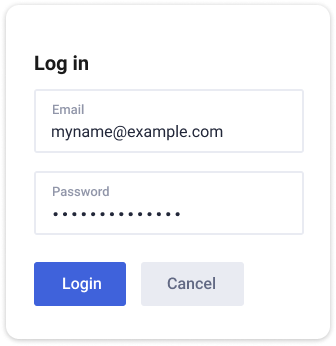
8. Style your drop shadows

When adding shadows to your containers or elements, it’s a good idea to avoid the standard, bulky shadows that your design software of choice typically generates by default. Instead, to achieve a softer and more natural look like in the example on the left below, you can use the following settings (or experiment with your own): X – 1px, Y – 8px, blur – 24px, spread – 0. Using a variation of your primary colour instead of transparent black is also a good way to make the overall design more cohesive.

DO

DON'T

A blue, grey and black colour palette used in the UI design of a mobile app