
Menu
BY STEER73 DELIVERY TEAM
Effective user communication with design
Implementing proper communication in user interfaces can not only secure a successful conversion rate but also solidify the confidence customers feel about the company’s brand as a whole.
In this article, we’ll explore the importance of effective user communication, types of communication and ways of achieving them.
Let us start by looking at a definition of effective communication:
- Effective communication is an interchange between two or more persons with the purpose of delivering, receiving, and understanding a message successfully.
Communicating via design
The same principles that are used when communicating with an interlocutor can be applied to interface design. Just like a writer or speaker chooses the right words to engage with their audience, a product interface should feature the right elements and interactions to clearly communicate a message to its user base.
In effective interaction design, communication is a two-way street: the product should interact with its users as much as the users interacts with the product. It is as important to tell users that they are doing things right, or to guide them through a process, as it is to inform them when they make a mistake. This kind of interaction can greatly reduce unclarity and frustration and is key to a pleasurable user experience.
When should communication happen?
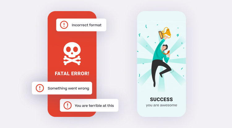
When we think about situations when a product communicates a message to its users, the first thing that might cross our mind are success states which let them know an action has been completed successfully, and the less pleasurable error messages which let them know they have done something wrong or that an error has occurred.
While these two scenarios are important and should be covered in any case, there are various other often overseen situations in which communication with users should happen:
On interactions
On successful task completion
Via onboarding
On loading states
On error states
When inputting data
Through visual hints
Through animation
Implicitly, through UI choices and imagery
- Communication should happen continuously, for as long as the user is interacting with the product.
Why is user communication important?
A little bit of communication goes a long way in increasing user productivity and engagement. It can:
Give users confidence that they are doing something right
Reduce anxiety that something has gone wrong
Keep users up-to-date and engaged
Speed up the learning curve of new users
Increase the speed with which they complete tasks
Clarify to users what input or action is expected/required
Prevent users from undoing something that they have done correctly
Prevent re-entering data, re-submitting forms and constantly using the back button
Types of communication
There are 3 main types of communication in UX design:
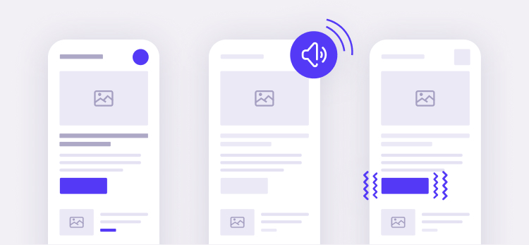
Visual communication
• Text / messaging
• Color
• Hierarchy
• Imagery
Audio communication
• Notification ring
• Success or error sound
• Keyboard tap sound
• Added to basket sound
Tactile communication
• Vibration
• Key press reaction
Potential user outcomes
When designing for effective user communication, we should be mindful and empathetic of the possible outcomes and meaningful ways in which we can motivate our users. Every experience can be encouraging, neutral or discouraging; ask yourself what your intention is as you build those experiences within your product.
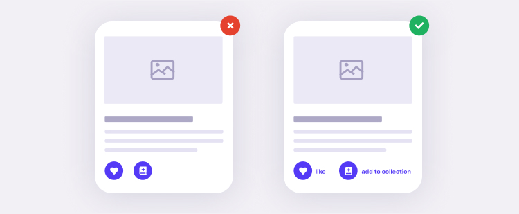
Making expectations clear
It is important to enable the user to make the right decision or perform the desired action by avoiding ambiguity as much as possible and don’t let users guess what an element of your interface is doing or what its meaning is.
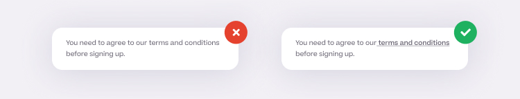
What is the meaning of these icons?
While there are some very common scenarios in which it is perfectly acceptable to use standalone icons, like for example an X for “close”, a pencil for “edit”, a plus for “add”, or a cog for “settings”, it is generally a good practice to support more unique icons with relevant labels, if their meaning might not be immediately clear to users.
Communicating at the right time (and avoid frustrating your users)
Timing is critical when it comes to effective user communication. It should ideally happen before the user is about to perform an action, giving them more information and clarity on how to perform it successfully and avoid errors. Let us consider a very common scenario, which I’m sure has happened to (and frustrated) most of you at some point.
Bad password etiquette
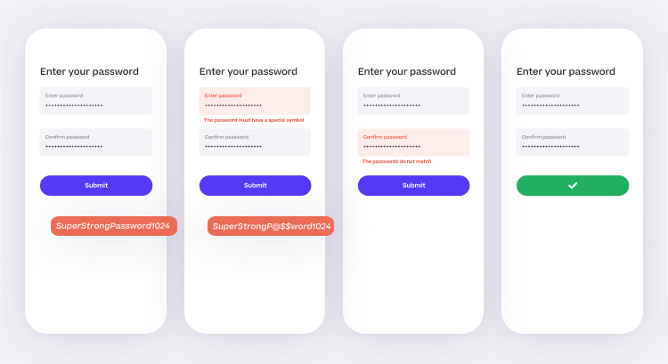
The following scenario is super simple: a user is in the process of registering for a new product and gets to the step where they need to input their password.
Our user picks a relatively strong password for this example: “SuperStrongPassword1024”. Confident that it is a good, secure password, they confirm it and submit the form. A first error occurs, letting them know that the password needs to include a special symbol. Irritated, the user changes the password to “SuperStrongP@ssword1024”, re-types it and submits the form the second time. A new error appears, letting them know that the passwords don’t match. The user inputs their password for the third time, finally being able to proceed to the next step and getting frustrated in the process.
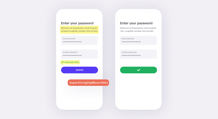
Now, let us explore a better way of doing it, this time by communicating things at the right moment:
First, we will let users know the requirements of the password right away, on the password input screen: it must include a minimum of 10 characters, a capital, a number and a symbol. Knowing the requirements, the user will input a valid password on the first attempt. Secondly, when the user confirms their password, we will add a real-time password match validation. Having all this information before they hit “Submit”, they are able to input their password successfully on the first try, considerably reducing the time needed to perform this action and the submission errors.
Anticipating next actions
By mapping out potential user flows and always thinking a step ahead, we can successfully anticipate what actions users are likely to perform next and enable them to take these steps more easily. For example, after adding an item to the cart, users might want to:
Update the quantity of the item
Add another item
Check out
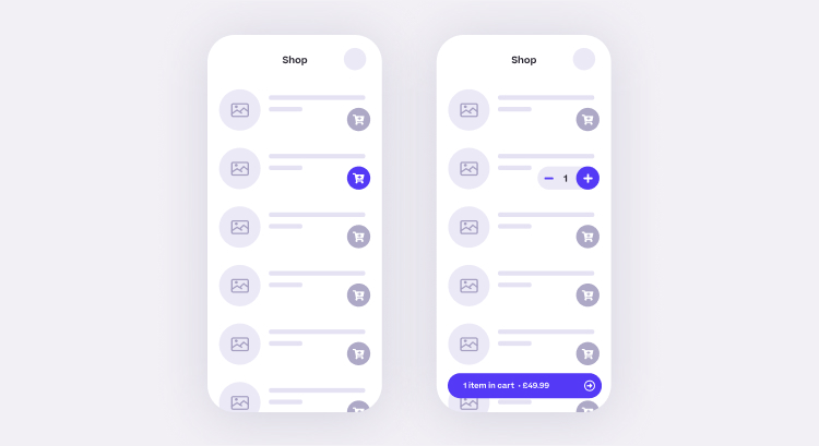
By making these actions available after a user adds their first item to the cart, we can make these flows clear for them.
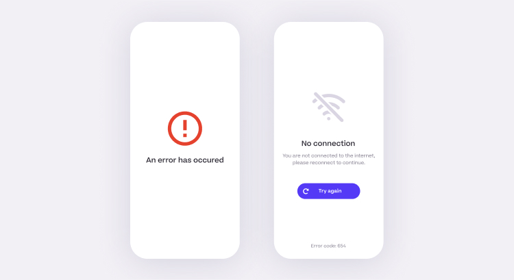
Handling error states
Error states can be more than just letting users know an issue occurred. They should:
give more information to users about what has gone wrong
let users know the cause of the error
if applicable, tell users what steps they can take to resolve the issue
display an error code which could help troubleshoot the nature of an error
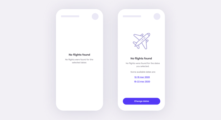
Loading states and empty states
Loading stated and empty states are often overseen when it comes to communication, and the messaging is sometimes reduced to something as simple as “loading” or “an error has occurred”, when in fact, they provide a ton of possibilities in terms of engaging the users and making their experience more pleasurable.
When users reach an empty state, they might ask themselves where to go from there or what alternatives there would be. An empty state (e.g. no search results found) can be used to offer users alternatives or complimentary actions they can perform as a next step.
Similarly, basic loading states like a spinner can create anxiety, especially if the loading time is longer. Users might ask themselves if there has been an error and they are stuck and might attempt to hit the back button to unblock themselves. A loading state is a good place to add a delighter, like a fun animation or a hint, to keep the users engaged while the next screen is loading and to let them know it might take a bit longer than usual to see the results.
Conclusions
Clear messaging and communication to users is key to a pleasurable user experience. Communication is more that error and success states: it should happen continuously during the user interaction and can take various verbal and non-verbal forms. With proper communication, frustration and user errors, the main killers of a satisfactory product interaction, are avoidable most of the time.
Implementing proper communication in user interfaces can not only secure a successful conversion rate but also solidify the confidence customers feel about the company’s brand as a whole.
Input your search keywords and press Enter.
This website uses cookies to ensure you get the best experience. By continuing to use this website, you are agreeing to our cookie policy.