


Input your search keywords and press Enter.
A suitable navigation pattern for a mobile app/site depends on the information architecture and nature of the mobile app or site. This article lists the most common mobile navigation types, along with pros and cons of each, and guidelines on when to use them.
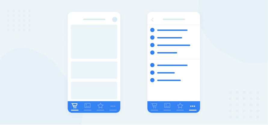
One of the most popular, accessible and discoverable forms of mobile navigation, present in popular apps on both Android and IOS, the tab navigation is almost always a user friendly approach to mobile navigation.
1. High discoverability
2. Limited number of items makes navigation easier
3. Communicates user’s current location in the app clearly
4. Persistent, always visible and reachable
5. Placed inside the thumb zone and easy to access
1. Limited number of items makes it unsuitable for some types of apps, if used as the single form of navigation
1. In apps with relatively few top-level navigation options (up to five). The tab bar makes the main pieces of core functionality available with one tap, allowing rapid switching between features.
2. In most apps, alone or combined with a secondary suitable navigation pattern
3. Secondary navigation options can be placed inside a “More” tab or a top right icon that can list them on a separate page or drawer (eg a “Settings” menu)
Once a very popular navigation pattern, the space saving hamburger menu has been proven problematic as a primary navigation through various UX studies.
1. Can accommodate a large number of navigation options in a small space
2. Clean design
1. Low discoverability makes it unsuitable for apps with multiple primary navigation options
2. Navigation options are hidden by default and not visible to users
3. Clashes with standard navigation items on native IOS apps (the back button)
4. Hides context and doesn’t communicate the current location at a glance
5. Extra action required to move to a different screen (one tap to open the menu and another one to select the target).
1. As secondary navigation for apps that have a single primary screen ( eg Uber, a To-Do app )
2. When the main content is reachable though the primary screen (on feeds, listings, etc.)
3. For settings or profile/account menus that are less likely to be accessed frequently
While most navigation options try to take as little as possible screen space, this form of navigation takes the opposite approach. Users incrementally tap or swipe to reveal additional navigation options as they scroll up and down.
1. Promotes simplicity and coherence
2. Allows prioritisation of desired content
3. Enables progressive disclosure, organising large chunks of information in a coherent manner and revealing information without overwhelming the user
4. A larger screen area offers more design options
1. Takes up the entire screen space
2. Requires scrolling in some cases
1. In listing and category driven websites or apps, where they work especially well ( ordering apps, travel apps, fashion apps, real estate listings etc).
2. Funnelling users from broad overview pages to detail pages helps them to home in on what they’re looking for and to focus on content within an individual section (eg user is looking for greek restaurants on a food ordering platform, or is looking for jackets in an online fashion store)
3. Works well when combined with a secondary navigation option (a hamburger menu to hide secondary functionality, or a top tab navigation to filter through the options)
Made popular through Material Design, this versatile and powerful navigation pattern can be used in various scenarios, either stand-alone or combined with other forms of navigation.
1. Allows highlighting the primary action on the screen with its eye catching design
2. Takes up little space
3. Studies show that once users have successfully completed a task using the element, they are able to use it more efficiently than a traditional action button
1. Can distract user’s attention from the content
2. Due to its fixed and floating nature, it can obscure content (do not use if the content underneath is not scrollable)
3. Being an icon only navigation, it can be ambiguous if its intent or action is not clearly communicated via the choice of icon
1. In simple, action-driven apps ( a to-do list, a barcode scanner, a camera app etc.)
2. Within an app, on a screen that is action driven (e g in a music or podcast app, as a play/pause button, or inside a conferencing app, on a call, as a start/end call button)
Similar to the bottom tab menu in terms of appearance, but more suitable for different types of usage, the top bar menu can be used effectively in a number of different scenarios, in particular as a secondary/supporting navigation.
1. Enables easy classification and filtering for listings
2. Works well as a second-level navigation
3. Can be used to group and separate content on screens where scrolling is not desired
1. In carousel form, where some menu items are obscured at first glance, users need to swipe horizontally to view all options
2. Can clutter the app with too many navigation options when used inappropriately
1. For listing based apps, as a way to group content into categories or filter it ( a food ordering app, a travel app, an events app etc.)
2. As secondary navigation inside a screen, to organise subpages that belong to the same category (eg on an “Transactions” page inside a banking app, to separate incoming and outgoing transactions)
There is no such thing as a “one size fits all” navigation pattern. After analyzing the nature of the product, its purpose and information architecture, a suitable pattern or mix of pattern can be determined. Adapting these patterns or creating a hybridisation is not wrong either, as long as it makes sense in the context and enhances the overall usability of the product.
Input your search keywords and press Enter.