“Very often design is the most immediate way of defining what products become in people’s minds”
Jony Ive
Bad design leads to poor interactions, which essentially leads to bad products and, often, bad outcomes.
Good design is not only impacted by the flow and functionality of a system. The user and the environment need to be carefully considered.
In this article we explore some of the key UX considerations for a system we built for DHL, a system used in an industrial setting.
What were we building?
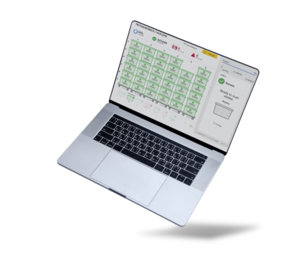
We built a shipment scanning system for DHL to replace the manual process of scanning each shipment with a handheld scanner.
The new system replaced this manual process by wheeling a large trolley full of shipments past a physical scanning device. The system then scans all the shipments, processes them, highlights errors and displays key information about shipments, as well as important analytics.
The system is essential for ensuring that the right shipments go to the right place at the right time (with nothing left behind).
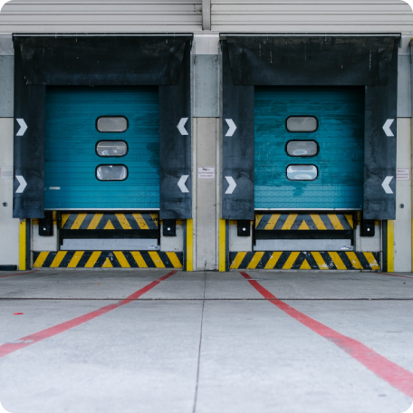
Where is the system being used?
The scanners are located in a series of large warehouses. During the winter, these warehouses get very cold and operators need to wear gloves.
Therefore, the touch screens used to operate the system needed to be usable even if gloves were worn.
What did this mean?
Firstly, vastly enlarged active areas that could be operated with large, gloved fingers!
Secondly, we needed to be particularly careful about the layout of screens. This included ensuring that active areas weren’t too close together and paying close attention to which active areas were placed next to each other. All to avoid functions being accidentally pressed.
How do users physically interact with the system?
We defined a number of different users, two of which were operators and managers. Operators would need to interact with the system at close quarters, physically pressing buttons and carrying out tasks.
Managers on the other hand had more of an ‘oversight’ duty and needed to be alerted of the status of shipments to ensure no errors were occurring. This involved checking many different scanning towers throughout the warehouse.
To remove the need for managers to walk up to one tower, then walk back down the aisle and onto the next one, we decided to make the key information a manager would need visible from 20ft away. This meant they could simply walk down the aisle and see the status of 6 towers from a single place.
We created a ‘managers’ bar with enlarged information that a manager would need to review at a glance, saving time, increasing efficiency, reducing effort and improving adherence to procedures.
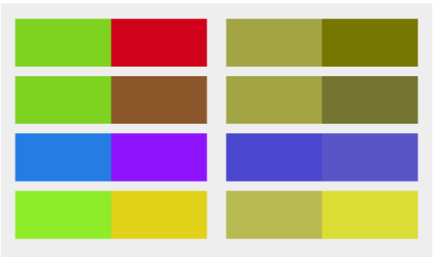
Accessibility for all users
One of the accessibility considerations we introduced to the system was ensuring it was suitable for people with colour blindness.
This impacted the colour scheme for the software. For example, the status colours green, amber and red needed to have contrasts that would ensure colourblind people could still easily differentiate between states.
This ensured there weren’t errors and that DHL would be unrestrained in hiring people who suffer from colour blindness in their warehouses.
Process flows to ensure adherence in the real world, regardless of circumstance
If there was an error with a shipment, the system would highlight this. To rectify the error in the system, we needed to consider what would happen in the real world and try to avoid a ‘decoupling’ of the two.
Considering the operational environment, we wanted to avoid an operator seeing an error, starting to fix it either on screen and/or in real life, then getting distracted midway through and forgetting where they were in the process. In busy operational environments this is extremely common.
To avoid this, Steer73 implemented not only a digital flow but also a physical operational flow that users were advised to follow. This included seeing an error, tapping the screen to begin rectifying it, going and solving it in the real world, then coming back to the screen to rectify it in the system. Thus, minimising the decoupling of the digital and physical world, as well as helping users understand precisely where they are in the process. This vastly reduced errors and increased efficiency.

Conclusion
Throughout the entire project, as with every project, there were countless other examples of similar considerations. With each, we first developed an understanding of exactly how and where the system was being used, and by whom. Using this information we could then build technology that reduced error rate, increased efficiency and felt effortless to use.
If you have any projects on the horizon, why not engage in our Free Discovery Service? We will deploy our tech and product teams to help you gain a deeper understanding of what needs to be built, the best way to achieve this and an indication of the costs involved. To find out more email us at info@steer73.com.